Our Film had multiple characters linked with each other via emotional connections in a specific location. This loose connection of multiple characters is reminiscent of "The View".
Non-diegetic was used, like our final film, to create depth to the characters. The poem also bares a resemblance to our voice-over; not telling a story but describing character traits or lives.
Off screen diegetic in our film and "The View" is the sound of the sea. It is used in both cases as a sound bridge and fades in and out. These volume swells help create a thoughtful maybe even retrospective feel. This in conjunction the non-diegetic soundtrack played throughout certainly parallels the scenes. The heavy organ and orchestra track played during the "superhero" scene of our film was composed to sound reminiscent of "this". The pounding percussion and huge organs are supposed to counter the images (as it is purposely meant to seem undramatic and "a bit rubbish" as it is trying to be humorous) but also it parallels the characters hopes and dreams (the part of themselves they have kept a secret).
 The film also tries to explore similar themes like alcoholism (although our film merely touches on the subject and tries to highlight depression and alcoholism caused by "post-traumatic stress disorder" and human reaction to conflict and death).
We have tried to imply this with the mice en scene (drink of 'Whiskey') after the nightmare sequence of our wounded soldier. This is also similar to "The View", as they only show a Hip flask.

Another example of mice en scene used to convey a deeper meaning is the pregnancy test seen here in a close up.
A close-up in both of these films are used to focus the viewer on the item.

Stereotypes were used in our film, as in the pregnant teen, this was to convey an idea or character easily and quickly with an audience. The pregnant teen is a traditional representation of a female in one respect. She is timid and emotional. She is told what to do by her father and does not show any real signs of resistance to his barked commands (perpetuating a patriarchy). On the other hand, she could be seen as a non-traditional representation as she is, quite clearly, sexually active. This element of challenging her traditional, religious background (mice en scene implied with the application of a cross around her neck).
Solely in terms of themes, our pregnant teen character could be comparable to "About a girl" (Brian Percival, 2001). Although our character is middle class and 15-17 years of age rather than younger.
 |
| Harvey's long shot helps created the sense of alienation and loneliness created by bullying the theme of this part of the story. The fact he is alone in shot much like all the characters whom are never in shot with another character. Again this gets across the alienation and lonliness of all the characters. |
The bullied teen character counters the traditional idea of a male figure. He is quite timid and is submissive and non-aggressive. Supporting this back-stories less traditional values is in the non-diegetic; a female voice can be heard. She is aggressive and loud. This is most definitely a dismissal of a tradition, sweet and submissive female character. This scene also uses an incredibly fast moving steady cam as well as a camera following the character. This is NOT a stalking scene but a metaphor for paranoia in the character. The bullies have effected him on an emotional level and he is believing these people are following him.
The soldier character can also be seen as a non-traditional representation of men. Although it is quite obvious a situation our character would have been through would cause distress in anyone, it is considered a traditional female characteristic to be emotional and "hysterical" (although this is caused by post-traumatic stress disorder).
Our "super-hero wannabe" is challenging a stereotype of the boring office worker. The concept of someone who spends so much time bogged down in a boring, inane job would have no imagination and would have to have "grown-up". Our film challenges this: showing the character dress-up and be quite stupid. It is meant purely as comic relief in one sense and maybe has a similarity to the short film "My Beast Friend" as in a character in a situation acts out of the ordinary (E.g. Cat is rude/office worker is childish and imaginative).
Our film poster was created to capture the same sense of alienation as in our film. The lead character is standing alone and is the only character in focus. We not only used an long shot to show the characters loneliness but it is also made up of 47 different images taken on location and set to 16% opacity to give the effect of the world rushing by. Aidan had an extra shot taken and he was extracted from the main image and placed on the top layer. He was then blended into the background.


Here's the final poster we created:


This "Harry Potter" poster is visually similar in terms of placement of the main character. This shows an audience the lead role.

This poster for "The Girl With The Dragon Tattoo" also plays with the opacity and uses plural overlapped images.
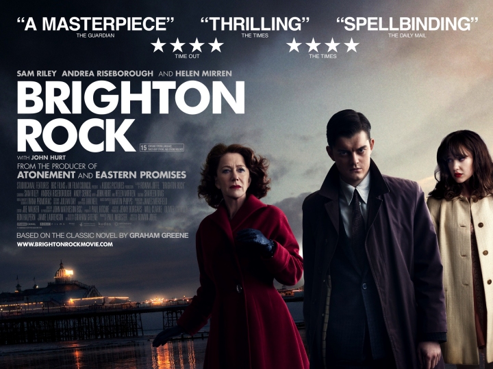
The text justified to the left also bares similarity to "Brighton rock" poster.
The little white lies article has achieved (I believe) a very similar aesthetic to the actual magazine.
 | |||
 |
| Genuine Little White Lies review. Note the beveled edge to the photograph. |
Here is a video on the creation and process of an issue of Little White lies.
The article was created in Adobe indesign. (bottom right).


Chloe's pencils drawing was used to a similar effect the magazine uses when there is a featured film. The eye drawing was a reference to our title.
2.
I believe that the poster conveys the same sense of alienation of the main character as our film. Putting the main character in focus and creating an effect that throws everything else out of focus has made the character seem distant just like the effect where there are no characters in the same shot as our main character until the very final scene.
As you can see in question 3, our poster is aesthetically pleasing and is likely to draw people in. The poster gives away minimal plot references, all that is known is the lead character, this is used to spark intrigue.
"On your poster... he looks a bit odd..."
- Andy Hampson.

The blurred, layered back-ground aids the same type of mystery as it makes it very difficult to identify the location. This is also why we chose such a generic spot of Brighton rather than, for instance, the peer. It could be anywhere.
The many layers can also, from a distance, look quite puzzling. So, it should draw people in. Using this natural inquisitive nature:
"...'How the hell did you make this effect[?]'"
-Amy Beckwith.
The tagline ("Don't turn a BLIND EYE...") is just a well known phrase and would not really give any plot away other than maybe the idea of powerlessness or distance from others/lonliness/alienation.
3.

I have put our finished poster up on the social networking site "Facebook".
The feedback shows a positive response to the design. Mostly on an aesthetic level. They also note the layout of the text.
"good lines ;) ha ha" - Jack Partridge.
":) looks real arty and love the blurred background" -Josie Charlwood
"it's well suited and artistic and doesn't distract from the main text" -Rosanna Berry
Although it was noted a slight design flaw:
"The only thing I'd say would be the 'Don't turn a BLIND EYE' text, just something about it, maybe needs to be a big bigger or bolder or something like that I'd say." -Tom Mills

After the upload, I realised we had failed to put our production company logo on and we had misspelt the word "association".
With the audience feedback I have received for our film I have found:
- The Non-Diegetic sound was a vital and much admired part of our film:
"I love the music, really brings out the sad [melancholic] feeling. Really suits the film [parallels]."
"The voice over during the superhero scene and the cut in music when he does his shoes was really funny."
"I really like the shouting insults [Non diegetic] during the bullying scene...it really makes it atmospheric."
- Some of our more "creative" shots were not as pleasing to the audience as hoped:
"...although the camera [steady cam] is way too shaky during the that scene[referring to the scene mentioned in the quote above].""it makes me feel sick!"
- Although our use of editing was applauded:
"The overlapped dream scene 'thing' looked really effective."
"The shaking and the really blurring effect on the bullying bit. I really like it. Incredibly effective with that soundtrack."
The people interviewed for this were between 12 and 50. This is to take a large demographic and a less biased feedback.
4.


I'm having a bit of an issue uploading (etc.). I'll try and get it sorted A.S.A.P.
ReplyDeleteI'm going to have to re-do most of the post due to an error.
ReplyDeleteVery incomplete Charlie. You have made a start but at this level of completion, you would struggle to get out of level one/low level two on the two questions that you have attempted. Read the guidance notes carefully.
ReplyDeleteQ1 - what about addressing issue of conventions to posters and reviews?
ReplyDeleteQ2 - see 5 mins as a minimum - make longer by all means.
Q3 and 4 - ??????????????????
One day left